I’m a pretty big fan of GNOME 3, the latest iteration of the popular desktop environment. The designers at GNOME anticipated that users would interact with their computers through touch, not just the mice and keyboards of today. Their attempts to satisfy both means of interaction led to a kind of hybrid interface design that isn’t too unlike what Microsoft unveiled with Windows 8.
This makes GNOME3 suitable as a desktop environment for a tablet computer as much as a laptop. This is great from a user’s perspective, where a consistent experience was threatened by the diversity of the hardware coming into the market.
As great as I find GNOME3, however, there are aspects that are wanting. The most notable of these is the application menu, which copies what’s found in Apple’s iOS and Google’s Android. Basically, it’s a screen with all the icons presented to you in one shot.

This clutter makes it difficult to spot what you’re looking for. The example above, from my computer, shows a menu with 54 icons displayed at once. Many users will have to essentially scan every one of these, a relatively lengthy exercise, to find the icon for the application they want. This isn’t much better than the old joke about the cluttered Windows desktop.

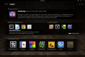
I think we can do better. Here is some concept art I devised for an alternate main application menu.

Instead of displaying all the icons at once, the user would be presented with a selection of the most frequently called applications and the most recently used. Users usually make use of a small pool of applications, much smaller than the totality of all the programs on their system, so this would cut down instances of pixel hunting.
The “Featured” application at the top would randomly select one installed application and pull its description. More experienced users could substitute this for a “recent documents” bin, but novices might appreciate the insight.
I think the design of full-screen application menus should take a page from the likes of the Ubuntu Software Center, whose designers have found ways to balance quality with quantity. It’s certainly a step up from the visual diarrhea of the current approach.