The hard drive on my laptop was dying, so I replaced it over the last weekend with a 500GB Seagate Momentous XT. This meant I would also reinstall Linux.
I had settled on Ubuntu as my distro of choice, but I was open to trying a new desktop environment. So I put a few to the test, seeing whether there was something better for me out there. I had been using GNOME 3 before the drive started to falter.
KDE 4: KDE was my standard desktop environment before GNOME 3. I was excited when KDE 4 was first introduced, though stability issues dissuaded me from adopting it until a few iterations later.
Like GNOME, KDE is a solid, mature, desktop environment with an eye that has come to value simplifying the default interface for users. Unlike GNOME, this simplicity has not come at the price of omitting advanced features for power users.
Despite design decisions that have prioritized a simpler look and feel, I do feel that overall KDE is a bit more “cluttered” than other desktop environments, and GNOME in particular. Your desktop always has an “activities” button in view, the default desktop comes with a great big “folder view” widget, the file manager window has more real estate devoted to buttons and metadata than actual files. I feel like the first thing I do when I get KDE up and running is just hide, hide, and hide more things.
Oxygen, it’s default theme, looks great. The visual effects are nice. The application launcher works well. It’s future is promising with the rise of QML. I wouldn’t be unhappy if this was the DE I had to deal with, though I settled for something else.
Cinnamon: Cinnamon didn’t like the fglrx drivers for my laptop’s older Radeon 4xxx graphics chip. The framebuffer would become a corrupt mess whenever there was a complex graphical operation like the application launcher fading in. Had there not been these issues, I would have picked this as my DE. Design-wise, it has all the things I like about gnome-shell and none of the baggage.
GNOME 2: I use it on my RHEL-based systems because it’s rock-solid, but it really shows its age in its lack of modern features. It’s not something that I’d want on my laptop, for which I favour the new and fresh. I didn’t give MATE a try, though perhaps I should have.
XFCE: It’s relatively lightweight and reliable. It used to be that it lacked some of the features of more established DEs, but I’d say it’s now on-par with the last generation of desktop environments (KDE 3, GNOME 2). That said, it does lack some of the graphical niceties of this generation’s worth of desktop environments, which is why I ultimately didn’t favour it for my laptop. A solid contender overall, however, and I use it on embedded systems.
LXDE: Very lightweight, but also light on features – too much so for a primary machine. I’ve used it in embedded systems in the past, and it’s on my Raspberry Pi now. Where possible, I’ll favour XFCE over LXDE however.
GNOME 3: This DE has received lots of flack lately, which I think is unfortunate. The GNOME team have had a clear vision of making an environment that’s as suited for traditional input devices as it is for touch. They did this well before Microsoft with Windows 8 or Apple with its iOS/OSX convergence. They’ve also taken a clear stance on making things simple, which I think is a big boon for Linux.
I love the workspace/application switcher in gnome-shell. I however really don’t care for the application launcher. Presenting everything at once in a grid, a la Android or iOS, makes the launcher cluttered to the point of being useless. It’s not much better than a grandparent whose Windows 98 desktop is completely filled with icons. This is where I wish the GNOME team would have taken a page from Canonical, which I think found a very nice solution to this problem with Unity’s lenses. Everything is neatly categorized and searchable, yet there’s still the large icons necessary for touch input.
The gnome-shell should have also made window decorations dissapear when the applications are full screen. Or at least make that ability optional. The most common screen resolution these days is 1366×768. With the default gnome-shell activities bar and the Adwaita window decorations, far too much of the screen becomes occupied by unusable space. Again, Unity handles this aspect better.
I think that the negative attitudes to GNOME 3 are undeserved. I have some minor niggles with gnome-shell, but they are just that: minor. This is a very mature desktop environment with lots of great ideas implemented. I applaud its designers for their vision, and sticking to their guns in the face of such overwhelming reaction. I didn’t mind using it before, especially with some adjustments, but ultimately I decided I would have a better experience with Unity.
Unity: This has become much more usable since Ubuntu 11.10, and is the DE I have settled with for now. If the team at GNOME had a design goal of making things easy, Unity’s was to reclaim as much of the desktop for the content that mattered. The minimalist scrollbars, the window decorations that dissapear when maximized, the integration of the application menu into the top bar. These ideas took some getting used to, but I’ve come to appreciate them.
I dislike Unity’s default application switcher. Here, I think the GNOME people do a much better job. I ended up installing CompizConfig to have alt-tab use the “scale” application switcher and have a window edge trigger the workspace switcher like in Cinnamon.
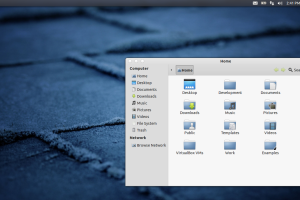
I also find the visuals rather ugly – I replaced the default GTK+ theme and window decorations for Zukwito and the icons for eOS Dark. As I recall I used gnome-tweak-tool to make that happen.
Making up for Unity’s deficiencies are the lenses, which let me search for applications and files with a simple press of the super button. Another great plus is its stability. Whereas gnome-shell used to crash on me occasionally, this has yet to do the same. I also like it’s integration with Google calendar via evolution, a feature also found in GNOME 3’s gnome-shell. Overall it works, and it works well.


