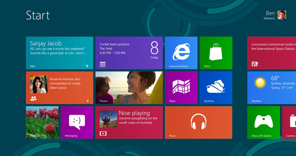
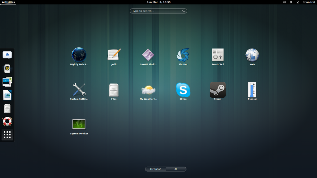
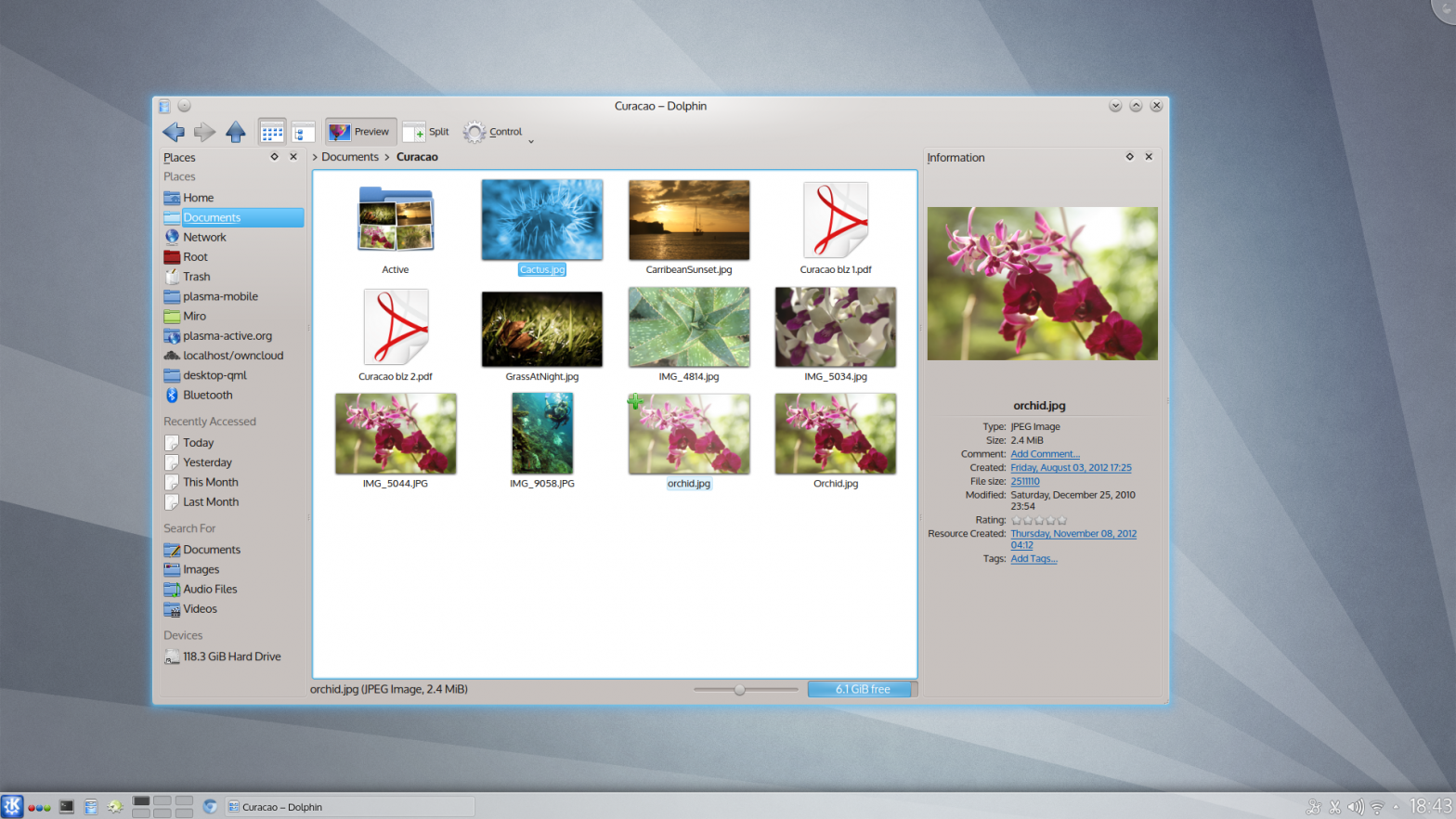
One thing is for sure: this Windows, Icon, Menus, Pointer (WIMP) paradigm we’ve been used to for our personal computing needs is going the way of the dodo.

We’ve seen with the rise of post-iPhone world the rise of intuitive software. It’s intuitive primarily because these programs have been stripped down to their core functionality. I think ease of use was always something developers strived for, and the iOS shook up just how far one could go with that.
That simplification in my view is a positive, and I think it’s a big reason for why tablets are so quickly replacing laptops. While I’m a big fan of this paradigm, I do wonder where does that leave power users like me. We want those features they’ve been throwing out.
They’re things we need when we develop software, edit videos professionally, or do anything at a level above and beyond what a handful of controls permit. So something more intricate will need to remain behind during this evolution to address those needs, but what shape will that take? That I don’t know.
Microsoft’s solution with Windows 8 is to package in a classic desktop. That works for now, but it doesn’t seem tenable. It’s a touch-hostile interface in a world that’s seeing that become the dominant form of interaction. It’s entirely disconnected from the main product. It does some things just plain worse in how it’s integrated.

Microsoft is in an interesting place, because they’re looking to offer a unified experience whether you’re on the recently announced XBox One, a smartphone, a tablet, or a PC. That’s a great thing to strive for. None of those, except for the PC, are typically thought of as power user territory though – so I can see them not seeking to address these issues and instead continuing to bundle these two very separate experiences with their PC OS.
What appeals more on my end is the approach taken by GNOME. They’ve come up with a hybrid interface that works as well with the mouse as by touch. Meanwhile, while still adhering to the WIMP paradigm, they’ve also embraced simplicity. All their bundled applications are about doing few things and doing them well.

But while GNOME addresses the issue of having both mice and touch screens as input devices, it is not as immediately approachable as Windows 8. It may not ever, given that it’s intended for an audience with more extensive needs.
That doesn’t answer where that leaves power users that rely on Windows. Will Windows continue to be that disjointed product, where the classic desktop takes on an anachronistic place like the command prompt does today? What about Apple? Will their next desktop OS continue the WIMP paradigm?
I don’t know about Apple. They’ve more or less had the same interface since 1984. That could be seen as a quality. Meanwhile, that design is also hostile to interaction through a touch screen, and their iOS powered devices have been immensely popular. So who knows. I wouldn’t be surprised if they tried to create a uniform experience like Microsoft, nor would I be astonished if they kept their desktop OS solidly in WIMP territory.

Comments
7 responses to “Power Users and the Future Desktop”
MD DOS4EVA
CD DOS4EVA
lmao.
For these kinds of posts I just look at the pictures…. 🙂
Nice article! I really hope terminals & cmd wouldn’t go extinct. I also wanted to ask for the link to the movie h4ck3r5
h4ck3r5 was renamed to Rice Tea.
I never finished shooting the movie. I just didn’t have the resources to pull it off adequately.
Not all was lost though. The film script became a book, which you can grab here.
Thanks!
I just finished reading ricetea and it was totally awesome! I wouldn’t like for my communication with someone of much intellects like you just end here. You can email me @ admin[at]securityinvaders.com or just reply with your email or your favourite IRC channel and nick