Over the years, a series of software products have emerged that have empowered the masses to achieve what was previously only the domain of professionals.
Apple’s iMovie let kids splice and add music to footage captured by a video camera. Microsoft’s Access acquainted office workers with the power of databases while Excel enabled high school students to drum up complex charts. Any individual with a smart phone could conjure a piece emulating Warhol with Instagram in seconds.

These program don’t turn people into experts, but they allow them to perform some of the basic tasks previously only achievable by professionals. For most people, that’s good enough. They don’t care about tweaking gamma levels in a photo, they just want to be able to remove grandma’s red-eye.
While the appeal in something like GarageBand might be easily understood, who could have foreseen the popularity of more esoteric products such as a spreadsheet program? It does lend credence to the idea that if you make a useful process intuitive enough, the general public will be willing adopt it.
To that end, I believe that there’s room for a product that would do to programming what Access did for databases. An application that enables people to create functions as easily as Excel lets them use them.
Such a product would be tremendously useful. It wouldn’t be a substitute for real software development, but would open the door to simplifying the life of casual users – allowing them to automatically backup family photos, download podcasts, etc. The alternative otherwise is to do these tasks manually, which is an incredible drain on time.
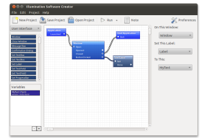
This isn’t anything new. The Illumination Software Creator, pictured below, is one such product that attempts to bring programming to the masses. Like many of its competitors, it uses a visual approach involving flow diagrams to represent the program’s logic. No code, no worrying about the countless different ways a computer could store a simple number.

It’s the right approach, but it lacks what all other applications like it haven’t had thus far – adoption. Microsoft’s Excel wasn’t the first spreadsheet program, but it was the one that popularized the genre. Likewise, there just hasn’t been that killer app to champion this concept.
While I don’t believe the proliferation of such applications is inevitable, I do think that the potential is there. There just needs for there to be the right circumstances at the right time, and perhaps a bit of hype.


